AG
Overcoming The Wave
12/2015
12” x 5” and 12” x 4”
Coarse Pumice Gel Mixed with Acrylic Paint on Canvas Paper
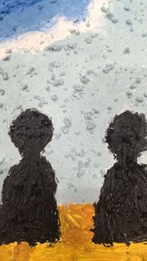
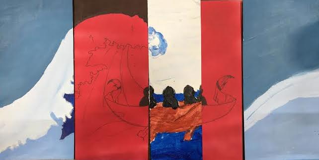
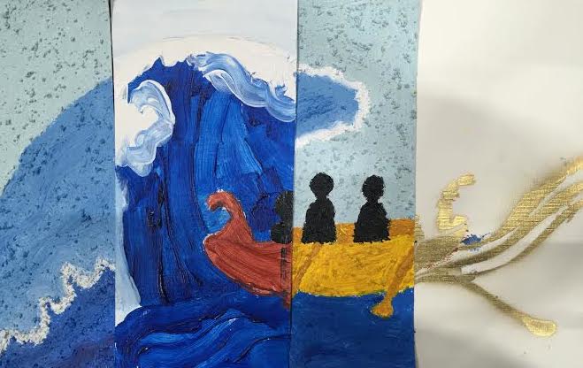
In our image you see a small boat, with four people inside, rowing towards a big wave. This is supposed to symbolize GCE’s mission to reinvent education and the school going against the traditional education system. The people inside the boat represent our community, because we are the ones who actually make this vision possible and make it happen. They represent both the students and the staff. The wave represents the traditional education system we are working to change and improve.
We didn’t come to create this image right away, however, it was a long process that didn’t just take one day. We started by looking at all our group members' sketches from the first Unit, in order to figure out the best elements from each image. We started out with MF’s Japanese wave because we really liked the details and how is looked. We also really liked LL’s layering, the simple message behind NVA's cellphone image, the detailed banner from BKJ's sketch, and the use of silhouettes from my sketch. We then tried to think oh how we could put these all to use into one image. We brought our images together, and decided on a silhouette of a person, pushing the wave over a symbol, we hadn’t yet decided on, that would represents traditional education, and a banner at the bottom that holds a sort of caption. We researched the meaning of the Japanese wave and found that it meant strength, which we thought is symbolic of GCE. After talking to our teacher, we decided to simplify the image and to switch our symbols so that instead, traditional education is the wave, and the thing it is above GCE. We decided the perfect thing to put in was a little boat with four people, swimming towards the wave. This was to represent GCE and their fight to go against standardized education and reinvent the system, and like I stated earlier, the people represent the GCE community that makes the idea of our school happen and come to life. We also decided to make the boat out of a banner, and write inside of it the title- “Overcoming The Wave”. This mural is both a revolt mural against the education system in America, but also a tribute mural to our school for all that they do for us and make happen. We recognize the battle they fight and appreciate all the work that is done to help make all this possible, and we want others to realize and appreciate this as well.
For my material, I chose to use coarse pumice gel mixed with acrylic paint. I chose this because when experimenting with many media in class, this was my favorite one. I enjoyed working with it, and even more so, the way it looked when it dried. Aside from just enjoying this medium, I also just thought it would look really cool for the foamy part of the wave. It makes that part of the wave seem to come out, and the crunchy part is almost like the bubbles that create the foam. I had a vision in my mind of the final mural, and that is what I saw for that part of the image. In the end I think my image was pretty cool because of the way it created the three-dimensional look I was going for, and it was really interesting to look at. However, I didn’t think this would work for the entire image, when everything has that “pop” it takes the attention away from from all the important elements in the image. That’s why it’s important to only have it for part of the image.


 AG . First Swatch. 12/2015 AG . Second Swatch. 12/2015 AG . Close Up Of Swatch. 12/2015
In the end, we really like the way everyone’s swatches looked and wanted to use each of the media that were chosen by the members of the group. We decided for the majority of the wave we would use both the semi-gloss soft gel, as well as regular gloss soft gel. For the foamy part of the wave my medium- coarse pumice gel. We decided the sky would look best in just acrylic paint, that the boat would be spraypainted, and the people be as well, but with stencils, not free handed. We think using all these different media will help draw attention to the key elements. Our boat will be a glittery gold that will really stand out and show that the symbol for GCE is the most important part of our mural.
In our image you see a small boat, with four people inside, rowing towards a big wave. This is supposed to symbolize GCE’s mission to reinvent education and the school going against the traditional education system. The people inside the boat represent our community, because we are the ones who actually make this vision possible and make it happen. They represent both the students and the staff. The wave represents the traditional education system we are working to change and improve.
 | |
|
For my material, I chose to use coarse pumice gel mixed with acrylic paint. I chose this because when experimenting with many media in class, this was my favorite one. I enjoyed working with it, and even more so, the way it looked when it dried. Aside from just enjoying this medium, I also just thought it would look really cool for the foamy part of the wave. It makes that part of the wave seem to come out, and the crunchy part is almost like the bubbles that create the foam. I had a vision in my mind of the final mural, and that is what I saw for that part of the image. In the end I think my image was pretty cool because of the way it created the three-dimensional look I was going for, and it was really interesting to look at. However, I didn’t think this would work for the entire image, when everything has that “pop” it takes the attention away from from all the important elements in the image. That’s why it’s important to only have it for part of the image.
In the end, we really like the way everyone’s swatches looked and wanted to use each of the media that were chosen by the members of the group. We decided for the majority of the wave we would use both the semi-gloss soft gel, as well as regular gloss soft gel. For the foamy part of the wave my medium- coarse pumice gel. We decided the sky would look best in just acrylic paint, that the boat would be spraypainted, and the people be as well, but with stencils, not free handed. We think using all these different media will help draw attention to the key elements. Our boat will be a glittery gold that will really stand out and show that the symbol for GCE is the most important part of our mural.
 |
| BKJ, NVA, MF, LL, AG . Collaboration One . 12/2015 |
 |
| BKJ, NVA, MF, LL, AG . Collaboration Two . 12/2015 |